Bikinis and a Weenie – Baby Shower Invite

When your good friend of almost 20 years asks you to design a baby shower invitation for her good friend, you go and do that thing.

This was a fun freelance project for my friend Emily that allowed me to explore and play with some retro ideas.

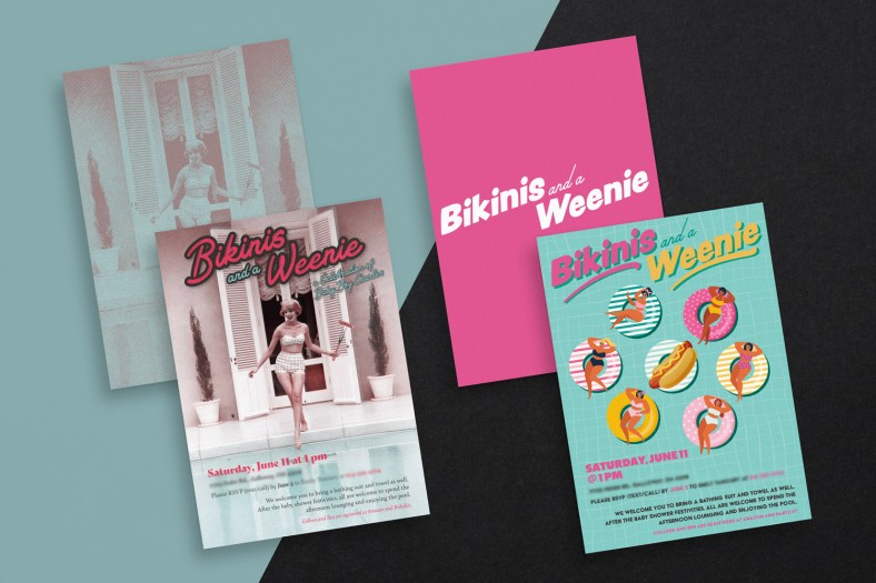
While I really love the design on the left, they went with the one on the right and I get it. It’s playful and it pops more.

I still wanted to feature both since I was proud of how both concepts turned out.

Budget was an issue and they were meant to be printed, so these were both designed to be standard 5×7″ cards that could fit into an A7 envelope.

As I mentioned up top, I’ve known Emily for almost 20 years and her reaction when I presented her with the concepts was so wonderful and sincere, it really made my day.

I knew there was a reason we’ve remained friends for so long.

CRPN Logo

Logo design is not my strong suit, but I’m always up for the challenge to improve at it. I recently had an exciting opportunity to do just that with a startup business connection made through my best friend Jon.

Daniel Fox MPH, Ph.D. is a translational scientist and clinical research advocate who created the Clinical Research Payment Network (CRPN) to provide a patient-centric model designed to align clinical researchers and pharmaceutical companies with his model to ensure researchers/docs are paid their true value, enabling more clinical trials which in turn lead to more breakthroughs and better outcomes that benefit the patient.

Daniel shared his passion, his story and his vision with me and our collaboration resulted in the logo you see above.

Daniel provided me with a great head start as we discussed his aesthetics – not a fan of lowercase, wanted something forward-looking and flowing but orderly and a color palette that was grounded/earthy/confidence-inspiring.

That allowed me a great direction to set out and start playing with. I gave him a lot to mull over and think about. I abandoned the usual three concept rounds and basically assaulted his senses with several potential directions. Each round we honed in closer to realizing his vision and I’m happy to say we arrived at it.

PCDesign

As an extroverted introvert, promoting myself has always been a challenge. I’ve always taken on freelance projects through friends and word of mouth and I realized I’ve never had my own personal business card. I decided to remedy that.

I wanted to incorporate some musical themes that have been major influences in my life, namely the industrial Factory Records look made famous by Peter Saville’s work on New Order’s (among others) record sleeve design and and a bit of the punk ethos.

For colors, I went with a black/fuchsia 1970s punk aesthetic because while I may not necessarily look punk on the surface, I’ve always resonated with punks’ early energy of discovering and embracing one’s individuality.