I am fortunate to enjoy a great collaboration with our videography and PR team at Johns Hopkins All Children’s Hospital. I have been encouraged to explore and learn more video animation and now regularly get brought in on our patient videos to provide intros and transitional slates and animated typography in what has become a seamless process with our videographer Juan.
While we strive to maintain a consistent look and feel from a brand standpoint, there has been a push to customize the patient intros so they more reflect the individual patient and their story. It’s a nice challenge and provides a chance to get creative!
Mahi is a firecracker battling – and winning – her struggle with cerebral palsy. She was born prematurely after her parents were involved in a car accident and her ability to maintain balance and walk has been a priority for her team at All Children’s.
For the intro to her patient video, I wanted to introduce a sense of movement to highlight the strides she’s made which are on display in the video above. The line art animation was a new wrinkle in my AfterEffects repertoire and once again I found myself excited and joyful at learning a new technique.
I fell in love with movies and moving images at a young age and I think personally moving past graphic design as a more static thing into this realm is what is really firing my enjoyment of the process. Vibing with our team as we think through the possibilities is just as important.

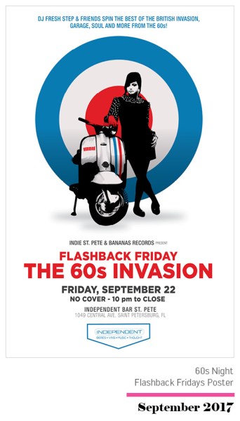
 After providing the Record Store Day poster design
  I was given a lot of leeway in terms of direction again this year. Since Bananas doesn’t really have a budget for these things, it’s essentially a pro bono gig. I’m big believer that designers should be compensated for their design. I’m also a big believer in the relationships you form with people and being in position to help out in ways that don’t always result monetary transactions. Let’s just say my vinyl copies of Depeche Mode’s Black Celebration and Simple Minds’ Sister Feelings Call have left me properly compensated. I look at it as a chance to flex my creative brain on projects outside of my job at the hospital. I’ve worked hard in recent years to build relationships that afford me the privilege to work on fun side projects like this.
 As with any design exploration, a lot of the fun is coming up with various concepts and then leaving it up to the client to decide which they like best because they always choose your favorite. Excuse me while I turn off my sarcasm alarm. I was really happy with my exploration on this one though and although my personal favorite is the minimalist design utilizing the banana silhouette as the arm of the record player, I was still happy with what Bananas chose.
 Hang the DJ. Wait, hang on a second.