Record Store Day

rsd-18-main

Record Store Day is kind of a big deal for vinyl fans. Being asked to design the poster and social creative for Bananas Music in St. Petersburg, Florida was kind of a big deal for me.

Begun in 2008, Record Store Day is an international event held at vinyl shops across the country and around the world. Bands release special edition singles and albums exclusively for the day. For instance, The Cure released Torn Down, a sequel of sorts to 1990’s Mixed Up compilation. Mixed Up was also re-issued as part of RSD.

Bananas, as many shops do, organized a day of deals, live music, food and a general celebration of the culture, community and camaraderie that orbit these venues.

Bananas RSD_FINAL
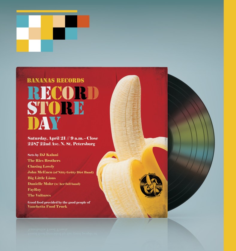
I was jazzed to be asked to design the poster and social media creative for the store, going for something clean and neat, with a brushing homage to Peter Saville’s design for New Order’s 1983 masterpiece Power, Corruption and Lies. The colored blocks above the album sleeve are color coordinated to the type below, a nod to the color chips on Saville’s iconic design.

rsd-18-concepts

I wouldn’t normally showcase the concepts I worked on prior to the final version, but I quite liked the pixellated banana idea I put together. It plays with the obvious implied sexual connotation, but by pixelating the peeled portion of the banana I was able to have some fun with it. It was my favorite concept, but it slipped to number 2 with the store.

Why no, I’m not above bad puns. Why do you ask?

New Order versus OMD

neworder_omd-header

Taking a page from my time in DC, I recently suggested that the monthly DJ gig with friends Jen and Genevieve expand to try a ‘versus night’, specifically New Order versus OMD, as both the latter and Peter Hook, former bassist of the former, were due in town in the coming months.

I was curious if the blissful, insane fun I had at Cure vs. The Smiths, New Order vs. Duran Duran and Depeche Mode nights at DC’s Black Cat (special nod to DJ Michelle Guided for providing much of that soundtrack) could be replicated – on a much smaller scale. And hey, if nobody showed, at least we’d enjoy a night of great music.

We sold the idea to a skeptical manager at The Independent Bar that hosts our low-key, all vinyl gigs. Now for a poster design.


The Design

It starts and ends with Peter Saville. Saville’s design defined an era. His work with Factory Records, his iconic cover designs for Joy Division, New Order, OMD and other post-punk bands emerging from the UK in the late 70s and early 80s are instantly recognizable.

I had a lot of fun playing in his sandbox as I went from producing one design to four. The designs are all mashups. The main poster utilizes the bold lines and streetmap grid look of New Order’s 2016 ‘Music Complete’ album while incorporating the tan, brown and green color scheme from OMD’s 1983 album ‘Dazzle Ships’, both designed by Saville. I added the fuchsia for some pop as I felt it complemented the other colors and contrasted the black line art well.

The typography is strict Helvetica, which lent itself to the utilitarian look of a lot of the early Factory Records and Hacienda materials.

Each of the posters pulls from New Order – OMD – Factory aesthetic and style – all shaped by Saville. Famously, the sparse ‘No’ that featured on New Order’s ‘Waiting For the Siren’s Call’ was actually a response by Saville to a request to design the album cover.

No Show Campaign

NoShow-portfolio


No babies were made to cry during the making of this campaign. Ok, one baby cried, but I can explain.

The No Show campaign was part of an initiative to make more families aware to call the hospital when they needed to cancel or reschedule, rather than just not showing up. By calling, it allows another family the opportunity to take that place and it leads to better scheduling and less lost time for clinical and support staff.

Our strategy was to create something  vibrant and clean with a simple and direct call to action, utilizing kids to tell the story, as we are a children’s hospital, while still maintaining our brand, which may be playful, but is not cartoon-y

I think for a rushed project, we really hit this one out of the park. The photography is crisp and the kids play directly off our headline copy. We were fortunate to utilize hospital staff kids for the photo shoot, which all took place within a few hours of one day. Backdrops were only accidentally torn down once, although silly string did end up all over the room.

Oh yeah, the crying baby.

That was kind of a happy accident, but because we had this project planned out so well, we were ready to capture a moment and add to our campaign. Our sad child was actually there to watch his sister (Can’t See Us?) but we decided to add him to the shoot. He was excited for his cookie and he was excited to run around the room. He was not excited to sit on the backdrop for  the actual photo though. My boss Neil captured the moment, however and Crunched For Time? was born!

His mom happily signed off on the photo.

Kicking Cancer With the Rowdies

Do you remember the scene in Raiders of the Lost Ark when the marketplace crowd disperses and a large, imposing swordsman does a series of flashy moves before a weary and having-none-of-it Indiana Jones pulls out his pistol and shoots him? Ok, stay with me on this…

In my role as graphic designer for Johns Hopkins All Children’s Hospital, I’m fortunate to work for an organization with a mission that’s kind of tough not to get behind – the care and treatment of children and support for their families.

While my primary role is in graphic design, our department allows us the freedom to explore and utilize our other talents. It was such freedom that allowed me and our videographer Juan to brainstorm an idea to create a partnership video with the Tampa Bay Rowdies for Childhood Cancer Awareness Month.

Juan is super-talented and had a basic framework in place. I came in with Indiana Jones. My idea was to utilize the spirit of that scene with our patient Vance facing off against one of the Rowdies’ players, which turned out to be Juan Guerra. Our department was on board and allowed us total creative freedom. The only catch? We had to concept, storyboard, write the script, film and edit in two weeks. Easy peasy.

As you can see in the video above, our team came through. This was shown at a late summer Rowdies match and led to a nice chunk of money donated to the hospital. I was thrilled to work with Juan on this project and thankful for the help of our marketing team and the clinical staff at the hospital for volunteering their time. Of course, the video doesn’t work without the Rowdies’ players, Guerra, Georgi Hristov and Keith Savage.

While I don’t necessarily recommend pitching a video idea about kids with cancer with Indiana Jones blowing away a bad guy, having a pop culture mindset does come in handy every now and then. It goes nowhere without a lot of other people on board lending their talents and it made me excited and proud to be a part of Kicking Cancer with the Tampa Bay Rowdies.

GFWC Clubwoman Magazine

gfwc-magOne of the primary responsibilities in my current position is the production of our organization’s bi-monthly magazine. We have a small, but dedicated staff that contribute content for each issue, while I am in charge of budgeting space, managing advertising and ultimately layout and design. I also handle editing and occasional writing duties. Ah, such is life at a small non-profit organization!

gfwc-mag2

The positive side of it is, the staff gets a good idea of what it takes to put together a publication such as this, and each department works closely to produce what usually amounts to a 28 to 36-page magazine. Of course, producing a magazine, even a bi-monthly magazine, takes a lot of time and effort. As the sole designer of all things GFWC, I don’t get the luxury of spending a lot of time crafting layouts and ideas. It tends to be pretty down and dirty as I have many other responsibilities in my role as communications director. I do, of course, enjoy the creative aspect of it, and given our tight time frames, I do my best to help produce the best publication we can. I also do have one person on my staff that I get to teach (inflict?) some basic design ideas on that helps alleviate some of my design workload.