 After providing the Record Store Day poster design last year for local landmark Bananas Records, I was fortunate enough to be asked to work on the 2019 version. Sometimes it helps to be in the know with those in the know.
 I was given a lot of leeway in terms of direction again this year. Since Bananas doesn’t really have a budget for these things, it’s essentially a pro bono gig. I’m big believer that designers should be compensated for their design. I’m also a big believer in the relationships you form with people and being in position to help out in ways that don’t always result monetary transactions. Let’s just say my vinyl copies of Depeche Mode’s Black Celebration and Simple Minds’ Sister Feelings Call have left me properly compensated. I look at it as a chance to flex my creative brain on projects outside of my job at the hospital. I’ve worked hard in recent years to build relationships that afford me the privilege to work on fun side projects like this.
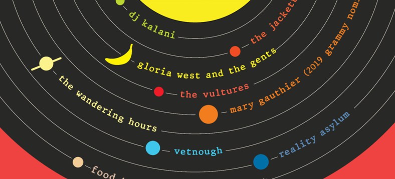
There are a lot of great designs of past RSD posters and since it’s an international event, that allowed for a treasure trove of ideas to inspire what became the finished design. I liked combining the idea of the vinyl record and its grooves with the orbits of our solar system’s planets. It helped that the lineup at the store consisted of eight acts and a food truck (sorry Pluto, at least you were represented).
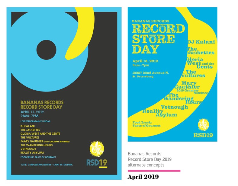 As with any design exploration, a lot of the fun is coming up with various concepts and then leaving it up to the client to decide which they like best because they always choose your favorite. Excuse me while I turn off my sarcasm alarm. I was really happy with my exploration on this one though and although my personal favorite is the minimalist design utilizing the banana silhouette as the arm of the record player, I was still happy with what Bananas chose.

